David Jonathan Ross(@djrrb) 's Twitter Profileg
David Jonathan Ross

@djrrb

I run a font of the month club!

ID:17969338

linkhttp://djr.com calendar_today08-12-2008 18:54:19

5,5K Tweets

6,8K Followers

2,7K Following

sami (◡‿◡✿)(@samiwittwer) 's Twitter Profile Photo

wanted to take a moment to thank Jane Perlez for bringing me and the Good Tape team in to develop the visual identity for her new podcast, 'Face Off: The U.S. vs China.'
A fun project and opportunity to use David Jonathan Ross's great Roslindale serif!
out now, in all the normal places <3


wanted to take a moment to thank @JanePerlez for bringing me and the @goooodtape team in to develop the visual identity for her new podcast, 'Face Off: The U.S. vs China.' A fun project and opportunity to use @djrrb's great Roslindale serif! out now, in all the normal places <3
account_circle
Type Network(@TypeNetwork) 's Twitter Profile Photo

Through his Font of the Month Club, David Jonathan Ross sends subscribers 12 new faces per year. After TN’s customary tech review, three of his more eccentric faces–Megabase, Megavolt, and Megazoid–are ready for your mega-designs!
👉 See these Megafaces Here: buff.ly/4bZVlrd
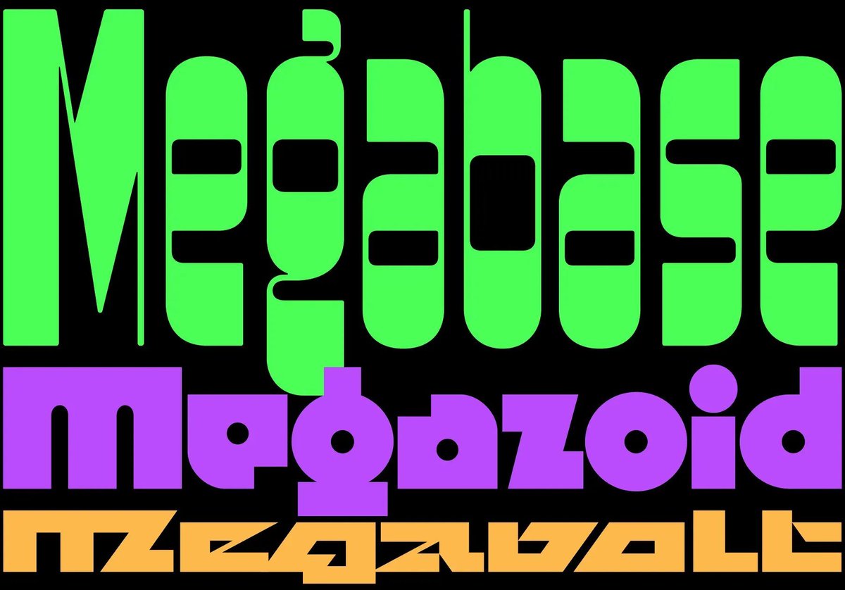
Through his Font of the Month Club, @djrrb sends subscribers 12 new faces per year. After TN’s customary tech review, three of his more eccentric faces–Megabase, Megavolt, and Megazoid–are ready for your mega-designs! 👉 See these Megafaces Here: buff.ly/4bZVlrd
account_circle
Fontstand(@Fontstand) 's Twitter Profile Photo

NEW: from David Jonathan Ross is Nickel Gothic, a stocky grotesque based on a lettering found on a 1918 Chinese banknote, with overtones of later midcentury sans serifs or ’70s squared gothics. Available in only one weight, but in 7 widths, all with an oblique style.

fontstand.com/fonts/nickel-g…
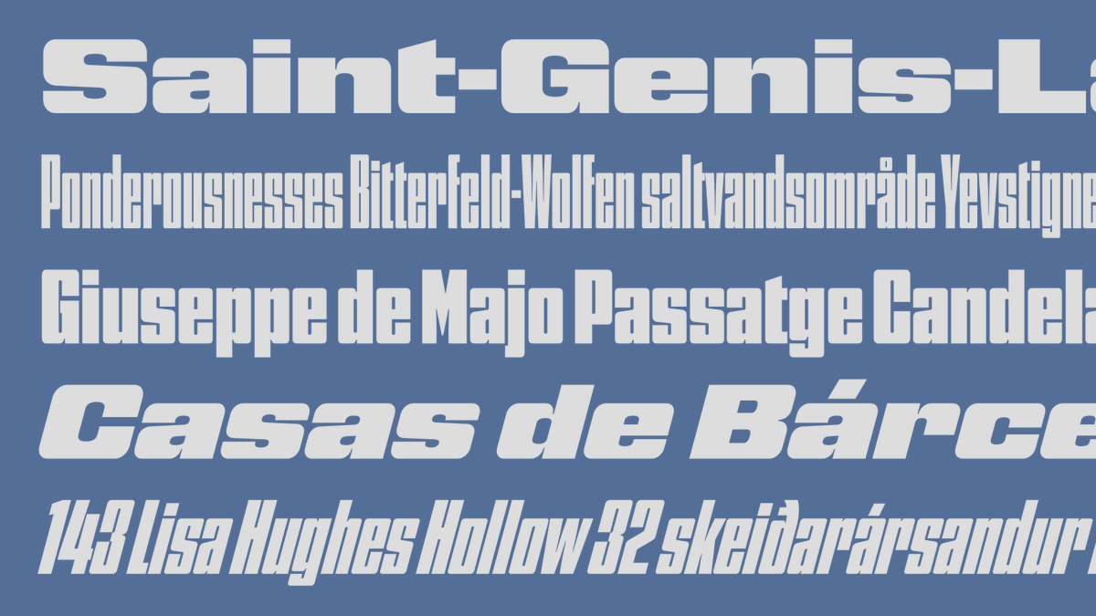
NEW: from @djrrb is Nickel Gothic, a stocky grotesque based on a lettering found on a 1918 Chinese banknote, with overtones of later midcentury sans serifs or ’70s squared gothics. Available in only one weight, but in 7 widths, all with an oblique style. fontstand.com/fonts/nickel-g…
account_circle
Fontstand(@Fontstand) 's Twitter Profile Photo

If you want to know more about our strategic thinking on font distribution, you might want to read the short article about Fontstand’s new Foundry Subscription model and why we think it can mean more freedom and convenience for both type users and creators fontstand.com/news/essays/fo…

If you want to know more about our strategic thinking on font distribution, you might want to read the short article about Fontstand’s new Foundry Subscription model and why we think it can mean more freedom and convenience for both type users and creators fontstand.com/news/essays/fo…
account_circle
Mike-麥-Mai-v1.618(@mikemai2awesome) 's Twitter Profile Photo

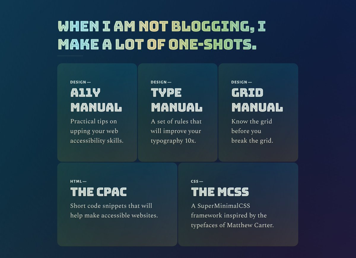
I love making humongous footers.

Bungee Inline from David Jonathan Ross is so beautiful that I had to resurrect my old CSS—from 2019—to use on my personal blog. mikemai.net/blog/

I love making humongous footers. Bungee Inline from @djrrb is so beautiful that I had to resurrect my old CSS—from 2019—to use on my personal blog. mikemai.net/blog/ #typography #GraphicDesign
account_circle
Fontstand(@Fontstand) 's Twitter Profile Photo

NEW: The Job Clarendon font family by David Jonathan Ross has been greatly expanded and now includes 3 new widths in the form of Skyline, Compressed and Extra Condensed in addition to the original Condensed width, plus a separate Variable font to cover them all.
fontstand.com/fonts?search=j…
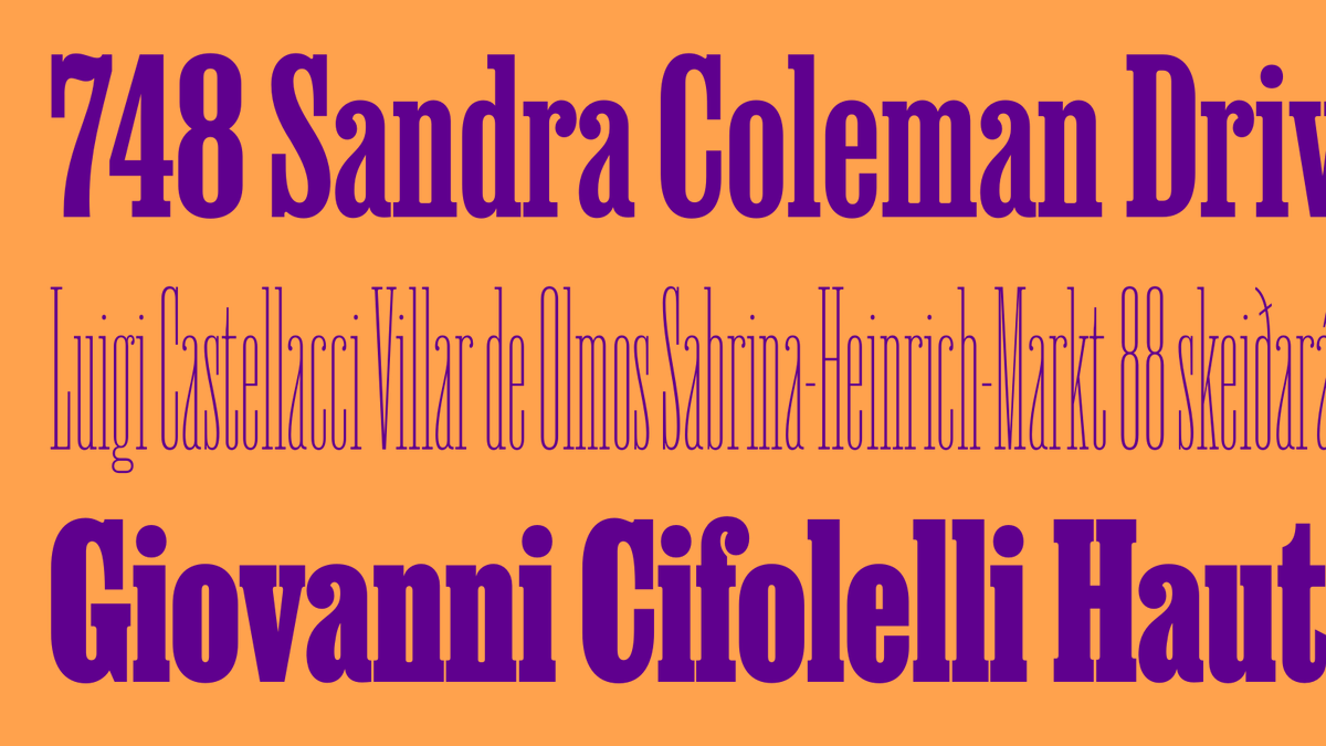

NEW: The Job Clarendon font family by @djrrb has been greatly expanded and now includes 3 new widths in the form of Skyline, Compressed and Extra Condensed in addition to the original Condensed width, plus a separate Variable font to cover them all. fontstand.com/fonts?search=j…
account_circle
ISType(@ISType) 's Twitter Profile Photo

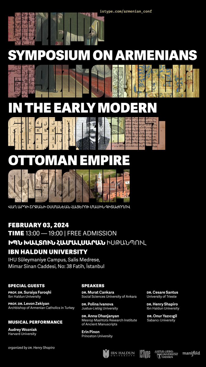
We’re excited to announce our second history oriented event entitled “Armenians in the Early Modern Ottoman Empire” “Վաղ արդի շրջանի Օսմանեան Հայերու մասին գիտաժողով”. Don’t miss this free event happening on February 3, 2024 in Istanbul → istype.com/armenian_conf/

We’re excited to announce our second history oriented event entitled “Armenians in the Early Modern Ottoman Empire” “Վաղ արդի շրջանի Օսմանեան Հայերու մասին գիտաժողով”. Don’t miss this free event happening on February 3, 2024 in Istanbul → istype.com/armenian_conf/
account_circle
Fontstand(@Fontstand) 's Twitter Profile Photo

Also NEW from David Jonathan Ross is Map Roman, an all-caps titling typeface that distills the elegant hand lettering style of 20th-century maps, with classic proportions, elastic curves, and extended end strokes on the vertical serifs, in 4 weights + variable style.
fontstand.com/fonts/map-roman
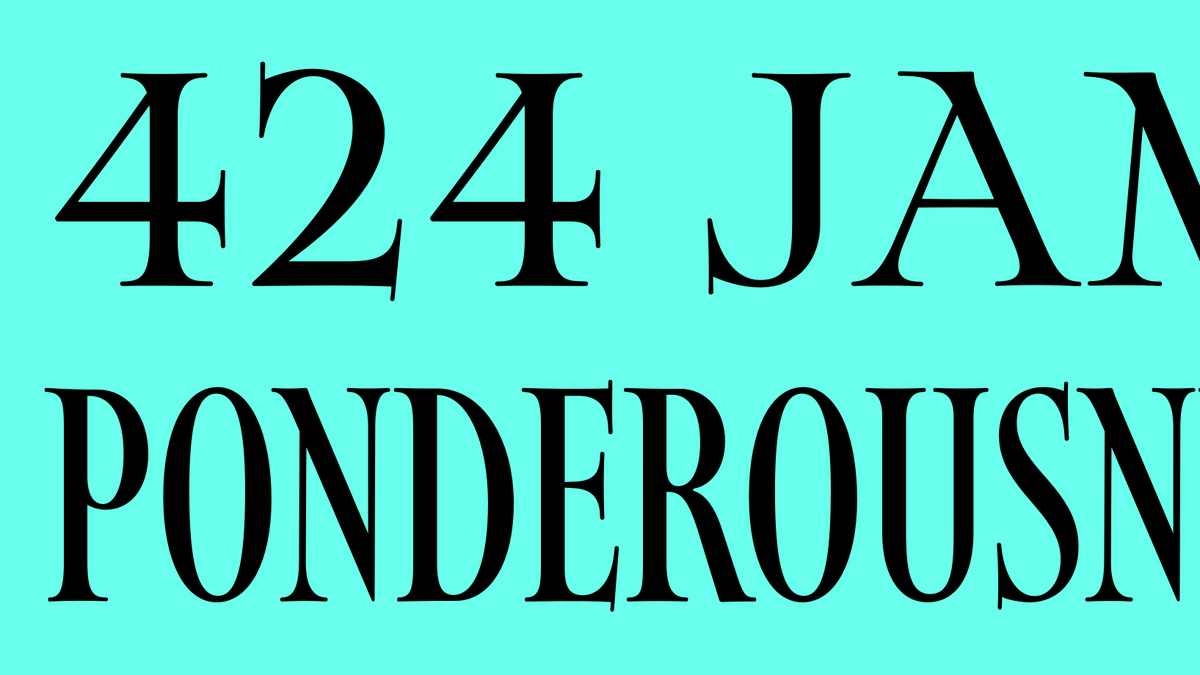
Also NEW from @djrrb is Map Roman, an all-caps titling typeface that distills the elegant hand lettering style of 20th-century maps, with classic proportions, elastic curves, and extended end strokes on the vertical serifs, in 4 weights + variable style. fontstand.com/fonts/map-roman
account_circle
Fontstand(@Fontstand) 's Twitter Profile Photo

NEW: Club Lithographer by David Jonathan Ross is a single style italic typeface inspired by a Victorian-era specimen book, keeping it's unusually steep 24° angle but completely recreated with much refined details, playing with the expansion style contrast in strokes.
fontstand.com/fonts/club-lit…

NEW: Club Lithographer by @djrrb is a single style italic typeface inspired by a Victorian-era specimen book, keeping it's unusually steep 24° angle but completely recreated with much refined details, playing with the expansion style contrast in strokes. fontstand.com/fonts/club-lit…
account_circle
Letterform Archive(@Lett_Arc) 's Twitter Profile Photo

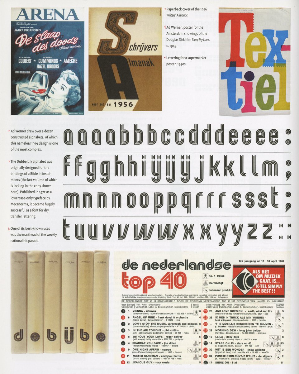
Jan Middendorp (1956–2023), Dutch Type, Druk Editions reprint of the 2004 original, 2018.

Perhaps best known for this comprehensive milestone publication, Middendorp’s numerous contributions to the world of typography will educate and inspire designers for generations to come.

Jan Middendorp (1956–2023), Dutch Type, Druk Editions reprint of the 2004 original, 2018. Perhaps best known for this comprehensive milestone publication, Middendorp’s numerous contributions to the world of typography will educate and inspire designers for generations to come.
account_circle
Nikola Kostić(@KosticType) 's Twitter Profile Photo

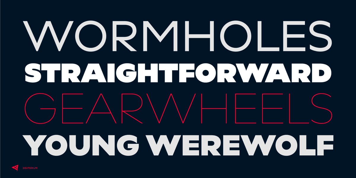
After more than 20 released typefaces, this is my first geometric sans. Deuterium (10 styles) is now on introductory promotion on MyFonts, family pack – 40% OFF. myfonts.com/collections/de…

After more than 20 released typefaces, this is my first geometric sans. Deuterium (10 styles) is now on introductory promotion on @MyFonts, family pack – 40% OFF. myfonts.com/collections/de…
account_circle
Jesús Rascón(@jesi_rgb) 's Twitter Profile Photo

i'll be developing Svelte Society 🧡 Advent of Code in this little webapp :) makes me so happy to build silly little stuff

also, gorgeous type from David Jonathan Ross, Fern

go check it out!

svelte-advent-code.vercel.app
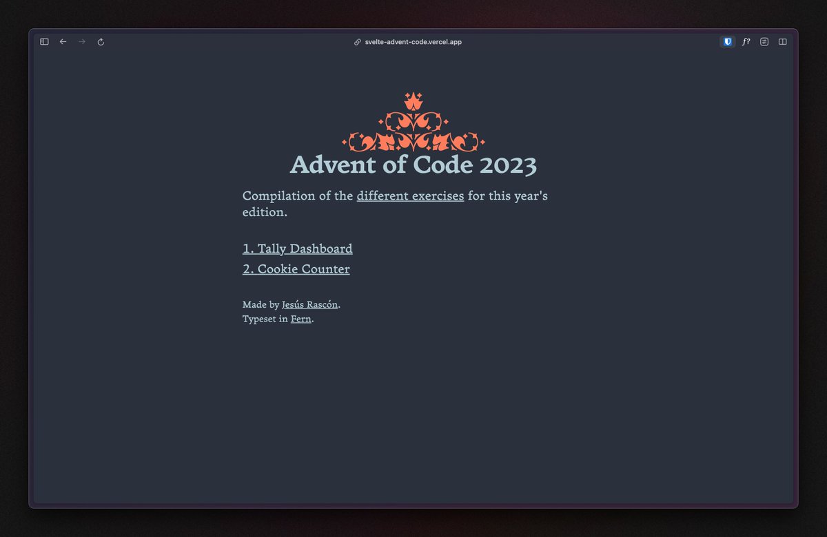
i'll be developing @SvelteSociety Advent of Code in this little webapp :) makes me so happy to build silly little stuff also, gorgeous type from @djrrb, Fern go check it out! svelte-advent-code.vercel.app
account_circle
Type Network(@TypeNetwork) 's Twitter Profile Photo

Calling designers and tech enthusiasts! Ubuntu's new variable fonts are here, embracing the open-source ethos. Ubuntu's philosophy, 'I am because we are,' embodies their mission. Now, their typeface is just as inclusive. Read the article buff.ly/3FNvkMF

Calling designers and tech enthusiasts! Ubuntu's new variable fonts are here, embracing the open-source ethos. Ubuntu's philosophy, 'I am because we are,' embodies their mission. Now, their typeface is just as inclusive. Read the article buff.ly/3FNvkMF
account_circle
David Jonathan Ross(@djrrb) 's Twitter Profile Photo

Congratulations @Scholasterik on the release of Agbalumo! It has been exciting to watch this typeface come together over the past year 🙌

account_circle