The Statistics Lie, Jon(@Stat_O_Guy) 's Twitter Profileg
The Statistics Lie, Jon

@Stat_O_Guy

You can't miss me.
I'm the one with blood splattered all over my smiley face.
#parody

ID:1372514213223075844

linkhttps://fullfact.org/health/mail-deaths-chart/ calendar_today18-03-2021 11:44:34

21 Tweets

132 Followers

32 Following

Tim Walker(@ThatTimWalker) 's Twitter Profile Photo

β€˜We desperately need an inquiry into how and why the lethal idea of herd immunity was taken seriously.’ theguardian.com/uk-news/2021/m…

account_circle
Full Fact(@FullFact) 's Twitter Profile Photo

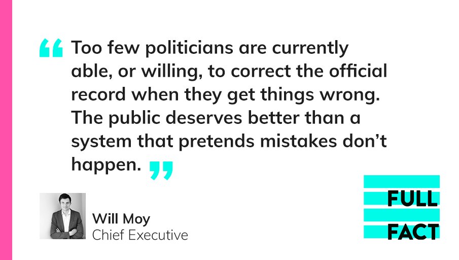
Parliament should champion honesty by owning up to mistakes.

MPs often talk about rebuilding trust in politics. This is an easy way to show they mean it.

We’ve written to the Speaker and other senior politicians πŸ‘‰ fullfact.org/blog/2021/mar/…

Parliament should champion honesty by owning up to mistakes. MPs often talk about rebuilding trust in politics. This is an easy way to show they mean it. We’ve written to the Speaker and other senior politicians πŸ‘‰ fullfact.org/blog/2021/mar/…
account_circle
Private Eye Magazine(@PrivateEyeNews) 's Twitter Profile Photo

US health insurance giant takes over 37 London GP practices, adding them to the 22 primary care services it already runs in the UK - and despite denials Matt Hancock's health white paper will make such privatisations by stealth more likely. Full story in new Private Eye, out now.

account_circle
Dr Rachel Clarke(@doctor_oxford) 's Twitter Profile Photo

How - after nearly 150k deaths from or linked to Covid - can the government *possibly* not commit to a robust, independent, public inquiry?

In medicine, we learn from our mistakes. They help us do better next time.

There are 150k reasons why this inquiry needs to happen - now.

account_circle
James Neill  β‰  𝕏(@jneill) 's Twitter Profile Photo

Full Fact Ross Clark Here's the chart as published by Mail+ and created by Jon O'Donnell (@Stat_O_Guy) for Ross Clark, with clarifications by @PoliticalASA and myself.

And note Full Fact it was a week 44 chart, not 45. They replaced wk44 chart in wk46 but with wk45 data, not the latest.

@FullFact @RossjournoClark Here's the chart as published by @DailyMailUK and created by Jon O'Donnell (@Stat_O_Guy) for @RossjournoClark, with clarifications by @gordonrlove and myself. And note @FullFact it was a week 44 chart, not 45. They replaced wk44 chart in wk46 but with wk45 data, not the latest.
account_circle
Full Fact(@FullFact) 's Twitter Profile Photo

The Mail used a misleading chart to give the false impression that weekly deaths were 'barely any higher' than in previous years.

Read our fact check here πŸ‘‰ fullfact.org/health/mail-de…

And you can find out how we take action to secure corrections here πŸ‘‡

fullfact.org/about/interven…

account_circle
Gordon πŸ“€ Data hunter-gatherer(@Gordon_DHG) 's Twitter Profile Photo

A_thankless_task Philip Montgomery James Neill  β‰  𝕏 Full Fact Ross Clark Mail+ The Statistics Lie, Jon FakeStatOGuy is a civil servant who freelanced that graph for the Daily Fail

I'm assuming one of the two journos who put their name to the story saw FakeStatOGuy's graph on social media & thought it would be a good graph to include in their story as 'evidence'
account_circle
Full Fact(@FullFact) 's Twitter Profile Photo

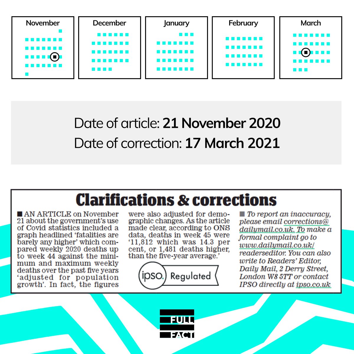
We're pleased that the Daily Mail have issued a correction in the print edition of today's paper.

But it's not right that this has taken almost four months.

We will continue to work hard to fight for timely and appropriate corrections and to hold the media to account.

We're pleased that the Daily Mail have issued a correction in the print edition of today's paper. But it's not right that this has taken almost four months. We will continue to work hard to fight for timely and appropriate corrections and to hold the media to account.
account_circle